Wednesday, August 4, 2010
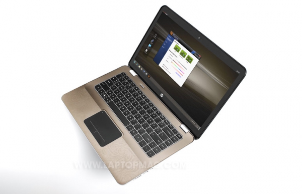
HP's Envy 14 Laptop Put Under the Microscope by Engadget and Laptop Magazine
Posted by Jason Dunn in "HP Laptops & Netbooks" @ 05:00 AM
Engadget: "The HP Envy 14 is like the final revision of a C+ term paper that always had potential, but just needed an bit of extra information and refinement to get an A. In fact, when HP introduced the Envy 14, the company was rather blunt about the fact that many of the issues that plagued the original Envy systems had been addressed, including the lack of an optical drive and backlight keyboard, the frustrating touchpad and the heat caused by the Core i7 processor."
Laptop: "About a year has passed since HP released its Envy 13 and 15, high-style notebooks aimed directly at Apple's MacBook Pros. We generally liked the designs of these metal-bodied machines, but their high prices and mediocre ergonomics dampened our enthusiasm. Now here comes the Envy 14, which starts at $999 ($1,289 as configured)."

I've read both the Engadget and Laptop review, and they've both given the Envy 14 an 80% rating - which is quite good for a Windows laptop. Note I said "for a Windows laptop" - most Mac laptops tend to get rated slightly higher, but that's pretty typical industry-wide. All in all, the Envy 14 looks like a real contender - but it's a shame HP couldn't do more with the battery life. The Envy 14 supports HP's battery slice technology, but the slice costs a staggering $200...that's 20% of the base Envy 14 price. Yeeouch! Still, expensive or not, I'm glad HP offers it - it's my opinion that laptop makers have gotten lazy when it comes to offering innovative extended battery options.
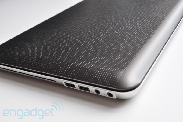
One of the things that I can't quite get over is that neither reviewer mentioned the extremely..."unique" pattern that HP put on the lid of the Envy 14. Seriously, this is not a subtle design:

I personally find that rather repulsive and wouldn't purchase the Envy 14 for that very reason; or, if I did, I'd immediately want to cover it up with a skin. I just don't understand HP's design choices sometimes; laptops are like phones in that they're personal extensions of your style. When you take out your laptop in public, you want to like the way it looks. Why does HP insist on these extremely aggressive designs on the lids? I like about 10% of the designs they put on them, which is one of the reasons why I end up buying Dell laptops - with a Dell laptop, I can select the colour I want, giving me the feeling like it's really "my" laptop. With HP, not only can't I chose the colour I want, I can't even chose to get it without the awful pattern on the lid!
What do you think about HP's designs? Do you like them? Does it impact your buying decision when shopping for a laptop?


